


OFFLINE · 12 SAFE
01 / FIELD → DATABASE
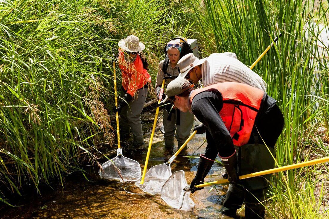
EcoPlot Mobile
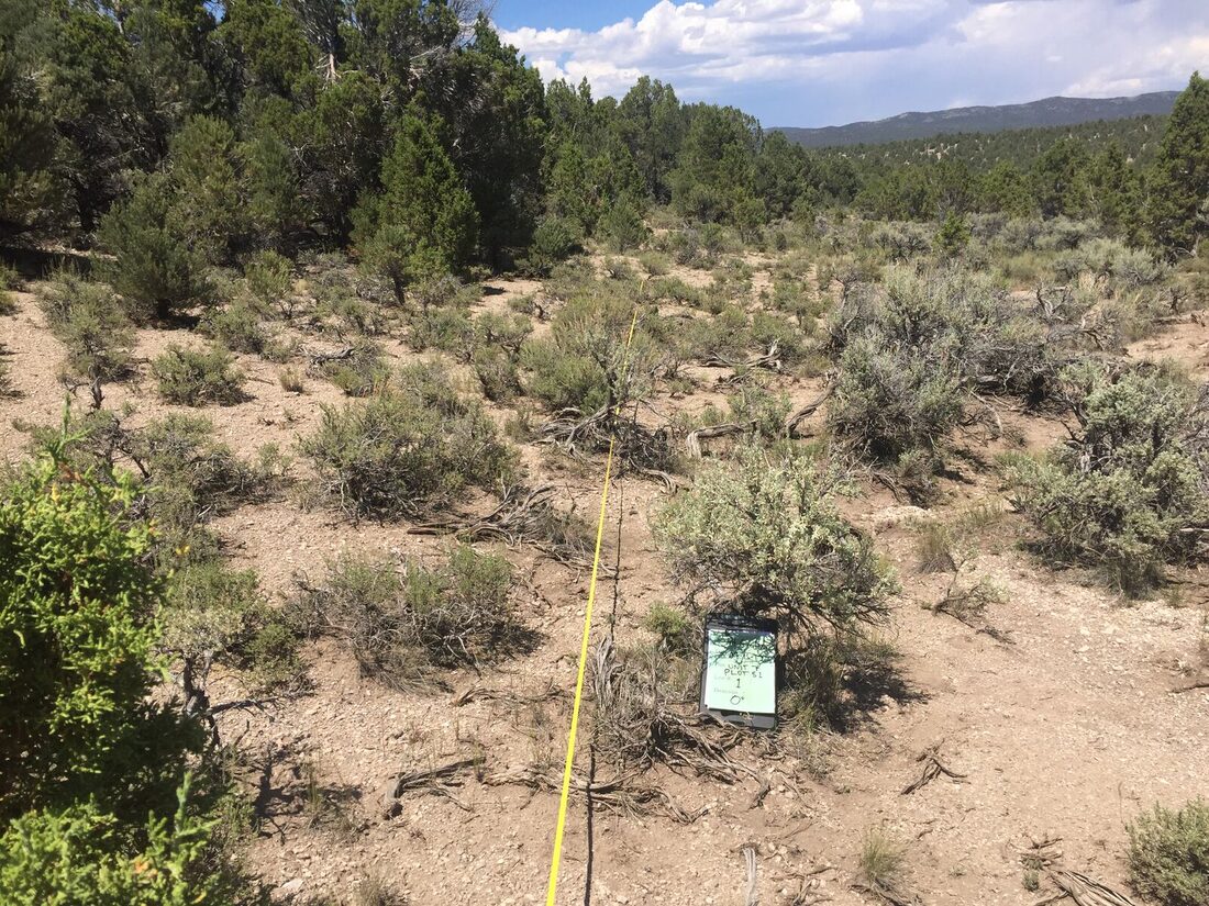
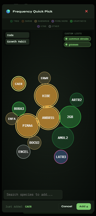
Offline vegetation data collection, cloud sync, office review, and reports. Built for places where the bars on your phone are mostly decorative.
- PWA
- Azure SQL
- Offline sync